A logo has been essential for companies, universities, sports teams and organizations of all stripes to create a brand identity and for customers to recognize it immediately. An overwhelming majority if these entities have maintained their logos for years and in many cases, decades as they understood the critical marketing imperative of having the company readily identified with their logo.
Logos appear on official communications, signs, advertising and various types of merchandise. Rarely do these entities tinker with them. If they do, it is usually subtle and just a few minor tweaks at that. They know all too well that maintaining a consistent logo works. It surely has worked well with companies like Coca-Cola, Walmart, Delta Airlines, NBC, Kellogg’s, Colgate, NY Mets, Royal Caribbean, Ford, University of Miami, Dallas Cowboys, Detroit Red Wings and thousands of others.
LGBTQ organizations benefit from their logos as well. The Human Rights Campaign’s popular yellow equal sign on a blue field can be seen on thousands of cars’ bumpers, businesses windows, t-shirts, caps and mugs. Whatever your opinion is of HRC, you must admit they know a thing or two about branding.
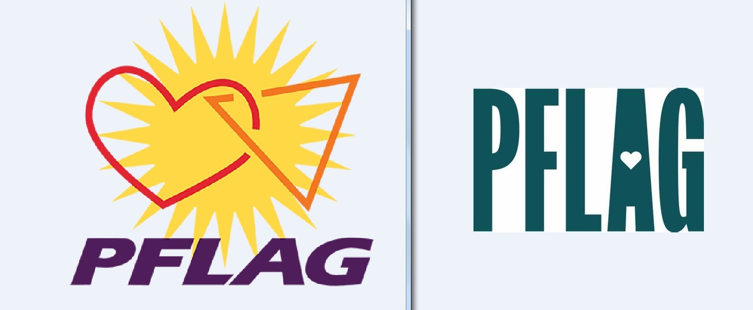
But PFLAG seemed to have ignored the basics of marketing and decided to dispense with the cheerful, colorful, distinctive logo on the left in favor of the new one that screams…meh.
If I had drawn this new logo in my 7th grade art class, my teacher not only would have given me a low grade but she would have also scolded me for a lack of effort and imagination. Simply put, it is visually unappealing and simply boring.
The change does not appear to be necessary.
I am not trying to dump on PFLAG. I love the organization with its hundreds of chapters nationwide and believe it is one of the most effective organizations in the LGBTQ rights movement. For over 50 years and through its volunteers PFLAG has succeeded in keeping countless number of families together and literally saved lives in the wake of hostility and discrimination.
I have been a volunteer in multiple chapters for a better part of 20 years and have written a slew of positive articles in the LGBTQ and mainstream press touting PFLAG’s invaluable work.
Their brand and reputation have always been wonderful, and even in today’s difficult times for LGBTQ organizations, it should capitalize on that brand.
I’m pretty sure it’s too late to restore the previous logo, but hopefully decision-makers at PFLAG National will see the light nonetheless.
1 comment:
I designed the original (sans the sun). I dislike the new design as it feels cold and unfriendly. Your comments are spot on Steve.
Post a Comment